Designing a Sticker for Provo City
I entered an art contest!
Introduction
Madalyn loves stickers. Every time we go somewhere like a farmer's market and they're handing out stickers, Madalyn loves picking some out. It makes her so happy, and seeing her happy makes me happy.
She's also into local events. She gets emails about things like the Utah Lake Festival, or 'bike to work day'. I even try to keep up to date on those types of events so I can take her to them.
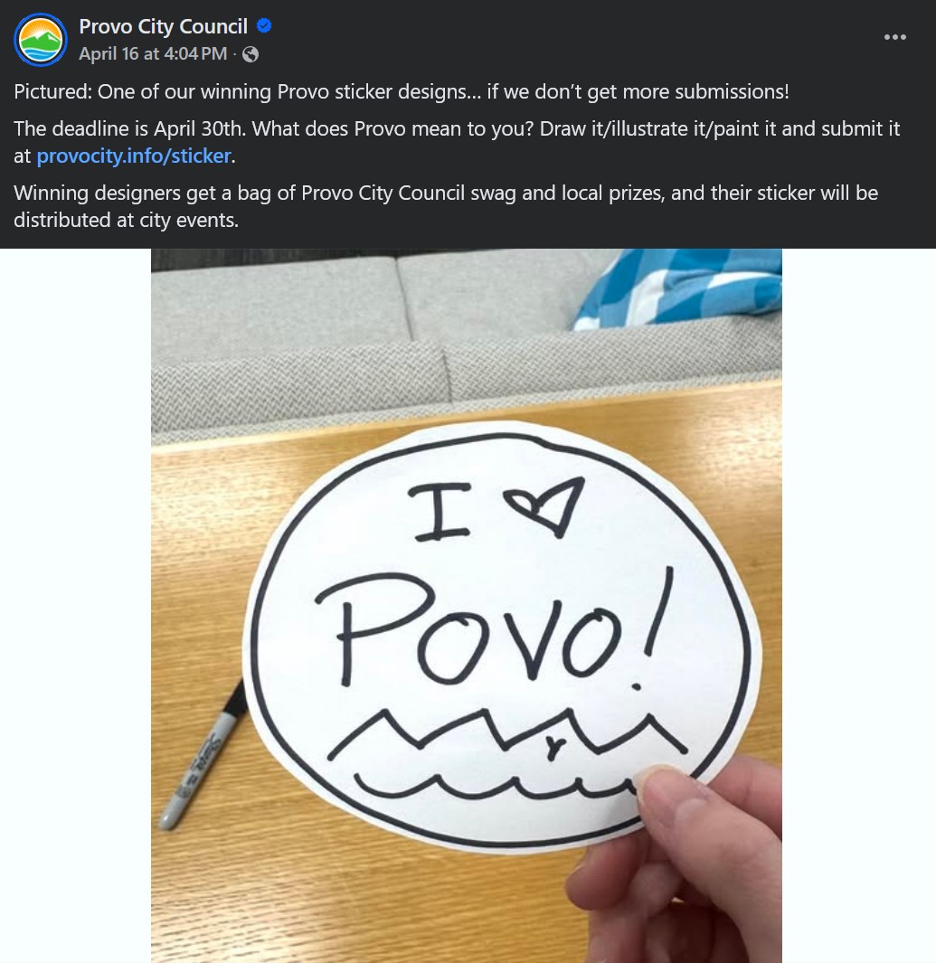
So, in mid-April, when I saw that the city of Provo was holding a contest to design new stickers to hand out, I knew I had to enter.
The Idea
I'm not a great artist in any traditional medium. I can't really draw, and I can't paint well enough to create something that would win a sticker contest. However, I am able to do cool things on the computer, so I figured I'd give that a shot.
Two of my strengths are that I can do 3D modeling, and I can work with game engines. While I was working on my 'stress dreams' game (which is currently on the very back burner), I learned a lot about late '90s graphics. I thought it could be cool to make a little Provo scene in the style of an older video game.
This was partly inspired by the fact that back in 2012, the Provo City Community Development Department modeled a couple hundred Provo buildings using Sketchup, which is very user-friendly, and very hard to incorporate into any other workflow. Because this was a public work, the models are available online. They were modeled by having someone go take pictures of the buildings, and paint those images onto 3D meshes. This workflow is similar to how 3D buildings were created in '90s games like Duke Nukem.
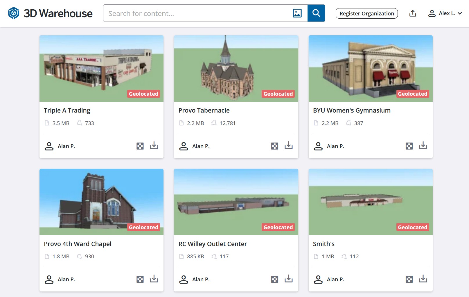
This meant I could download one of the most iconic buildings in Provo, Brigham Young Academy (The current Provo Library). This historic building was finished in 1891. It's so old that when it was completed, it didn't have indoor plumbing (which was added later).
This building housed what would become Brigham Young University, then a high school, and finally, the Provo Library. It's a symbol of Provo, and I thought it would be a nice focal point for my piece. I downloaded the model and it immediately started giving me headaches.
Technical Challenges
Sketchup is weird, proprietary software, and it caused me no end of suffering that they host their 'free' model library in a format (.skp) that is basically incompatible with the whole world. Theoretically, converting a .skp file shouldn't be too hard. There are online converters, a Blender plugin, and Unity can supposedly 'natively' handle Sketchup imports. However, none of them work very well. I spent hours trying to import the .skp file of the Brigham Young Academy building into Unity to no avail.
I also refused to pay for a subscription to convert one file. I was about to give up on the project when I found out I could get a one-week free trial of sketchup. With that, it was super easy to convert the file into a .fbx (a normal format for 3D objects).
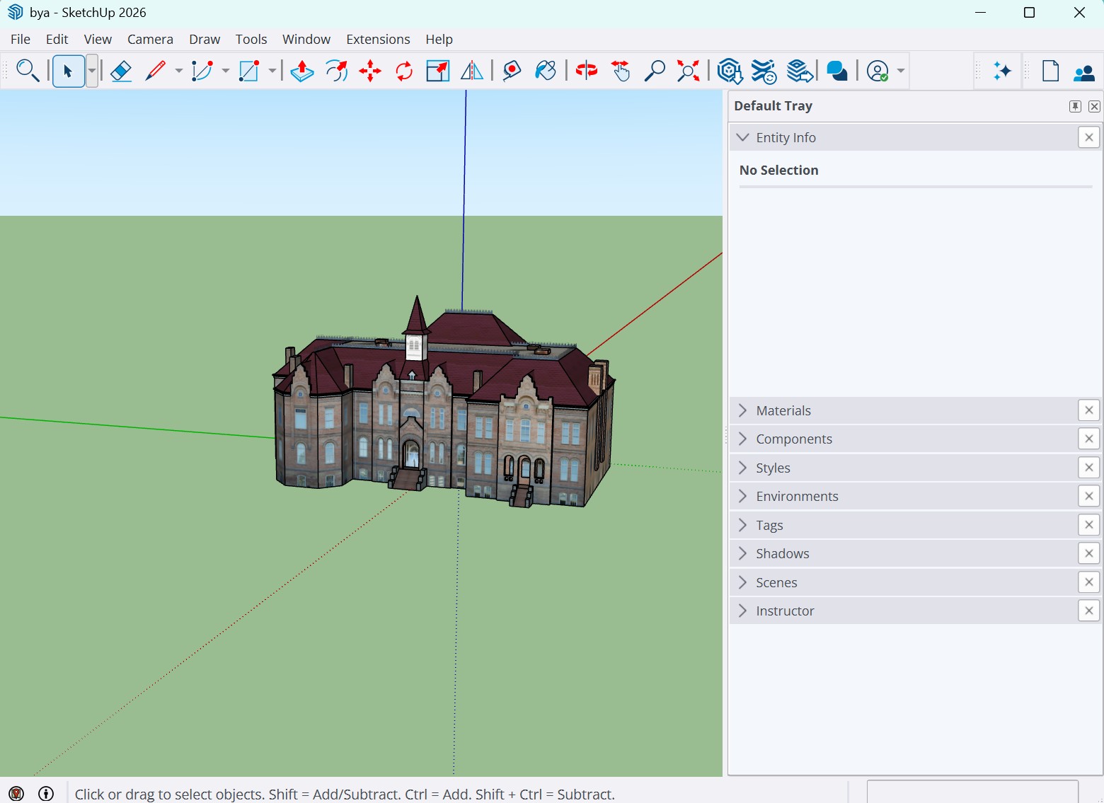
I imported the building into Unity, and downsampled the textures. This made the building pixelated, and it matched actual late '90s graphics very well. However, I couldn't just have a pixelated building floating in the void. I wanted to create a vibrant scene.
The Scene
If you've ever visited Utah Valley (where Provo is located), you'll know the most striking part of the landscape is the mountains. Provo, specifically, is known for the 'Y' on the mountain (for BYU). A sticker representing Provo needed to incorporate the mountains.
I found a picture online of the Provo mountains (including the Y), and used GIMP (an open-source Photoshop) to erase the sky, pixelate the photo, and remove a bunch of trees from the foreground of the image. I'm not a very good image editor, but since this was going to be a pixelated background, I didn't need to do super well - just well enough.
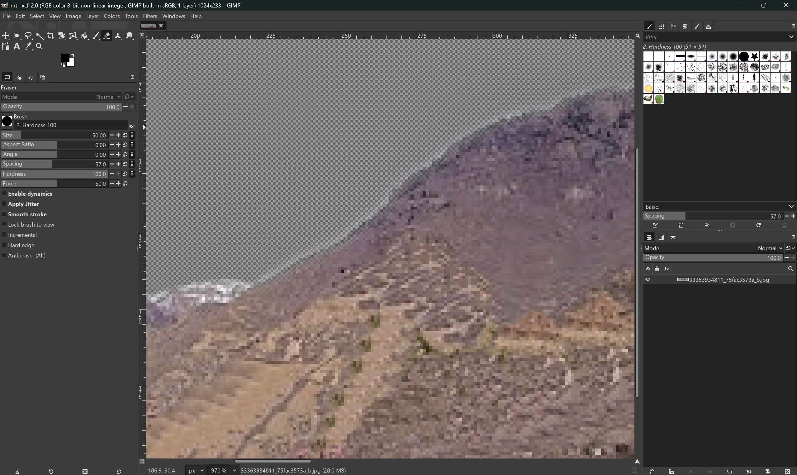
I just imported the pixelated mountains as a flat image behind the BYA building. (You can think of this like the backdrop at a theater.) I added some ground, but I needed the scene to come alive.
To do that, I imported a bunch of assets that I had collected while working on my back-burner game. I added cars, streets, lamps, trees, etc. Even though these items were lower-resolution, to really cinch the feeling of older game graphics, I added a final post-processing pixel filter. After all that, the scene looked great.
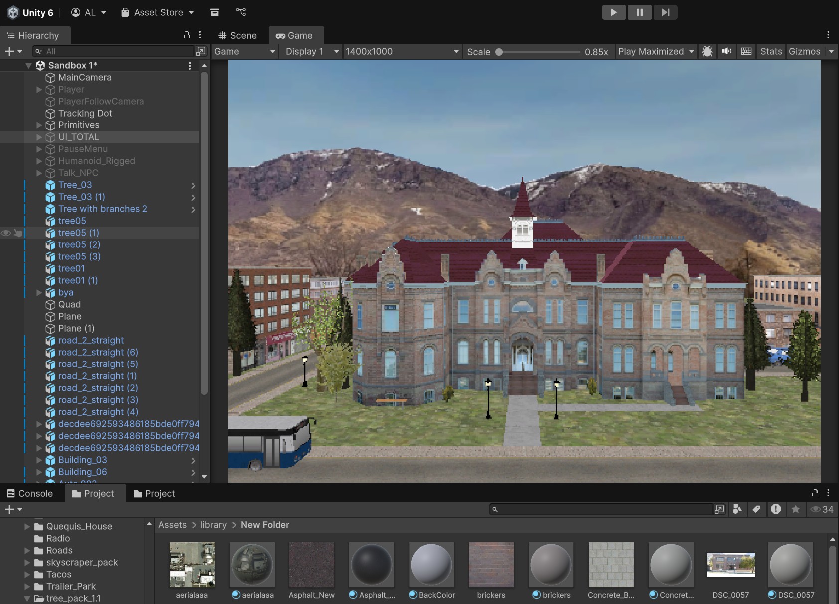
Of course, I didn't build a whole city. I just modeled enough to make the sticker look good from the exact angle where I placed the camera. This is how a lot of computer animation is done - only model what the viewer sees.

Text and Finishing Touches
It had always been my idea to have the sticker say 'PROVO' on it. The last step was to add the text and a little border to the sticker. I thought really hard about what font to use and ended up trying around 10 different public-domain fonts. Two stood out. One was a pixel font, which would go along with the pixelated look pretty well. The other was a strong, bold font. Ads for games in the '90s often used fonts like that in their advertisements or on game covers.
Adding this single word took a lot more work than I anticipated. I kept playing around with overlays, underlays, font weight, size, placement etc. Eventually, I sent these two options to my family and asked for advice.
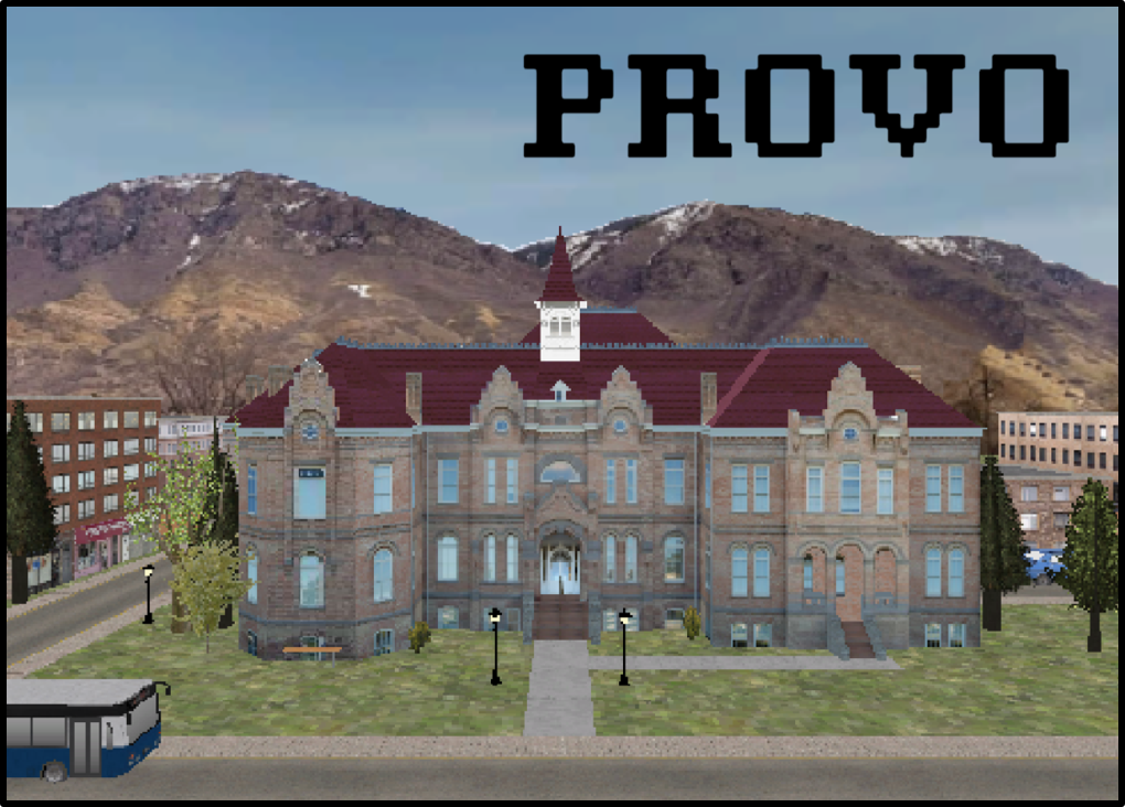
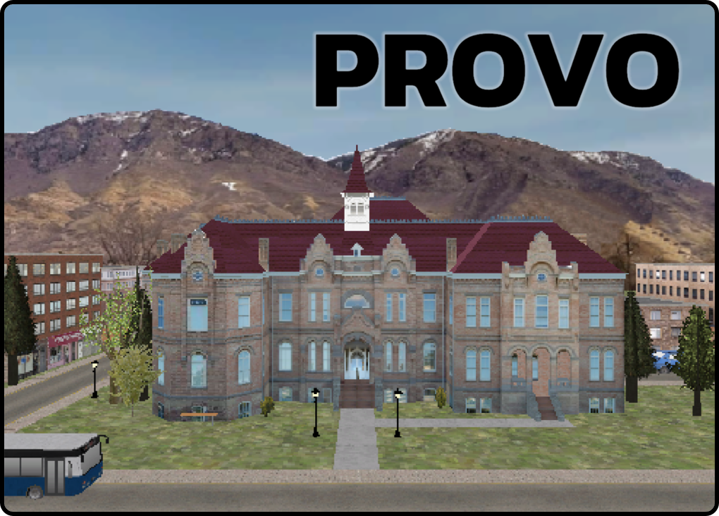
Their advice was inconclusive, so I ended up submitting both to the contest. I also popped a border on each version of the sticker, with rounded or square edges to match the font.
The Results
I submitted my designs on April 21, and the contest ran until May 1, so I just had to wait. On May 11, I got this form letter notifying me of my rejection.
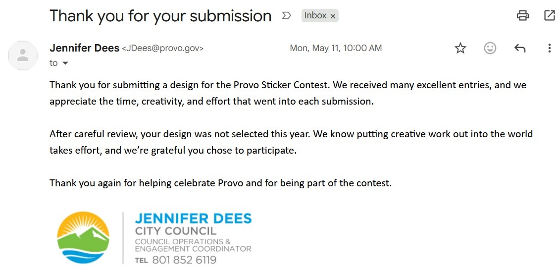
Unfortunately, there was no transparency regarding the review process. There wasn't public voting, so I don't know if Jennifer Dees just chose ones she liked, or what the process entailed. All the other stickers have a sort of hand-drawn aesthetic. Maybe whomever selected the winners had a certain idea of what a sticker should look like stylistically. I think the winning stickers were good, though not necessarily better than mine.
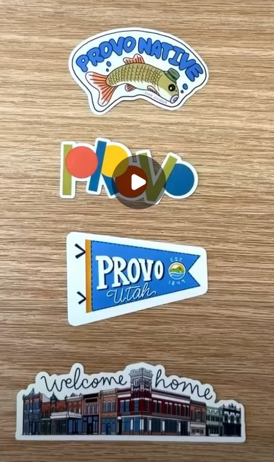
Not Letting That Stop Me
Not being selected wasn't going to stop me, so I contacted a sticker printing service and paid to get a sample pack of the sticker printed. These are water-resistant, weather-resistant stickers fit for water bottles, laptops, or anything else. They turned out pretty good, though they look a bit small in person. I probably should've gone up a size.
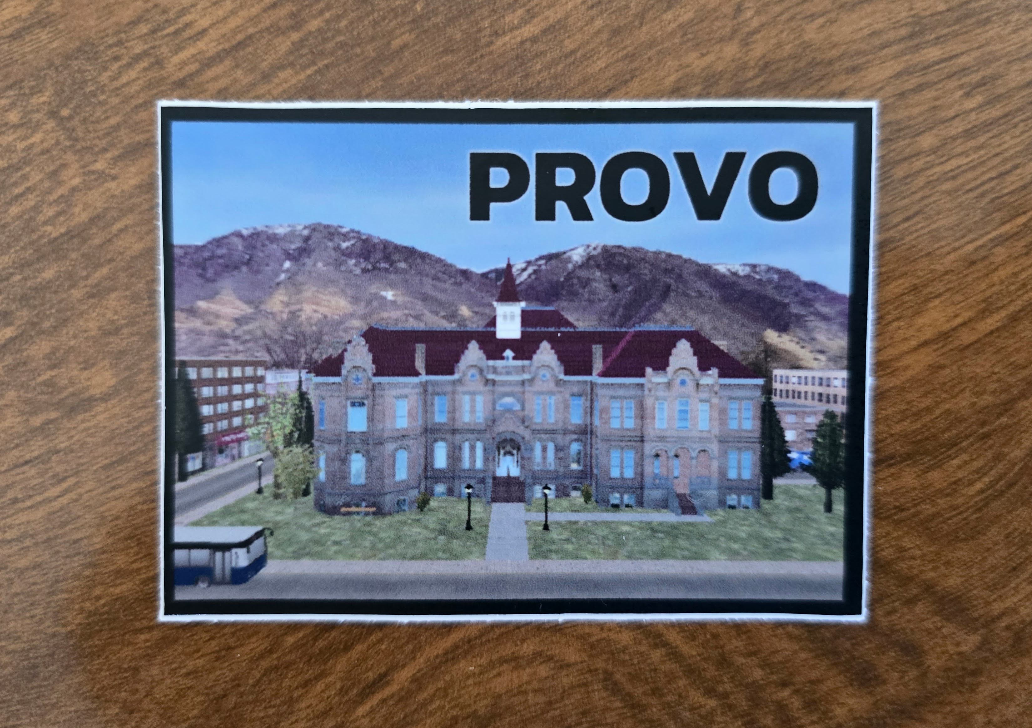
If you want one, let me know! My plan is to distribute these to my friends and neighbors so it's as if I had won the contest, and my stickers were distributed by Provo City.
Conclusion
Even though I didn't get chosen, I'm glad I tried something new. Entering contests is a great way to stretch one's creative muscles. Since not all of you will get a printed sticker, here's a short video showcasing how the scene 'breathes' on a computer. Obviously, a sticker isn't able to capture this, so instead it lives here.